
25 Best Practices for Nonprofit Websites
At Connect4 Consulting we specialize in websites for nonprofit organizations and small businesses. Nonprofit Websites have substantially different requirements than websites for businesses. Websites for non-profit organizations are essentially e-commerce sites with a single product – the donation box – or a single goal – growing engagement via subscriptions. The nonprofit website needs to clearly and convincingly communicate the problem, impact, and solution.
We look at many nonprofit websites each year and one thing is painfully clear: nonprofits and charitable organizations have a lot of catching up to do in terms of internet presence. For every truly great nonprofit website, there are at least a dozen other examples of what NOT to do. In this post we look at best practices for nonprofit websites.
Top 25 Best Practices for Nonprofit Websites
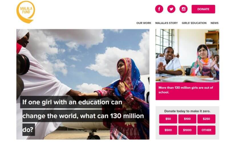
1. The Donate Button
Almost all nonprofit websites are trying to raise money online. With that goal, the donate button and the donation process is mission-critical. The donate button should be visible on every page of your site. Make it stand out by using a color that contrasts with the rest of your page.
Examples of Great Nonprofit Websites – The Donate Button
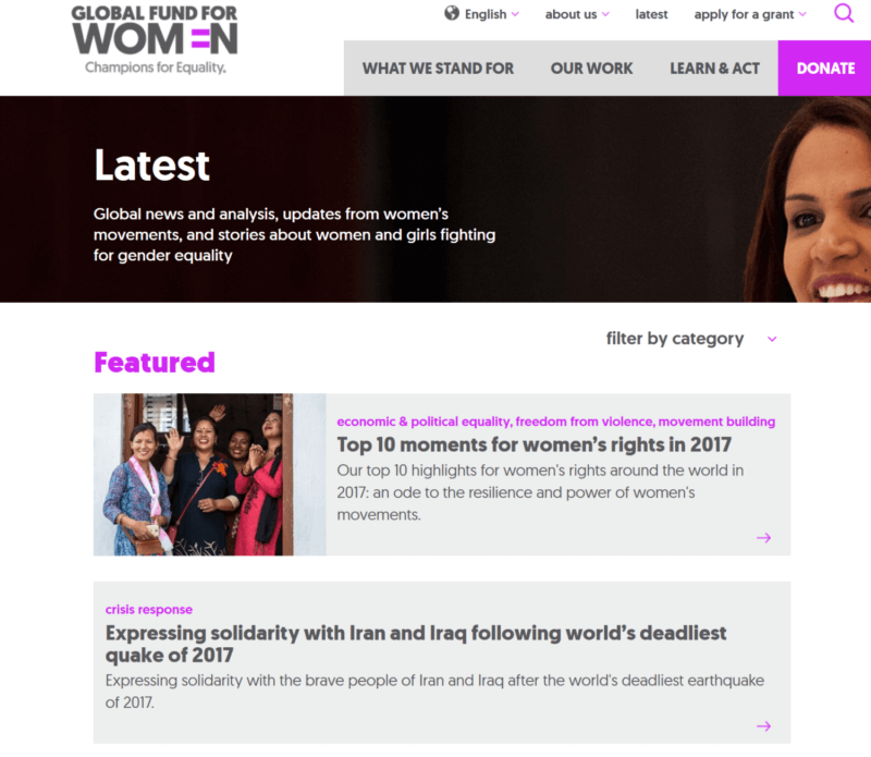
2. Problem
Don’t assume visitors already know what your organization is about. Prospective donors will find your site through organic search, referral links, and social media, and they may not be familiar with your nonprofit. You’ll need to clearly communicate the problem that your organization addresses. We recommend featuring a prominent link where visitors can learn more about the organization – including the problem you solve, who you help, and why it matters for visitors to get involved. Help visitors dive deeper into taking action by offering clear calls-to-action related to your organization’s core purpose.
Examples of Great Nonprofit Websites – The Problem
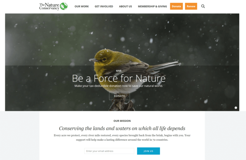
3. Solution
What is the solution that your nonprofit organization provides? The solution to the problem must be immediately visible and apparent to the website visitor. And the solution should lead directly to the impact statement.
Examples of Great Nonprofit Websites – The Solution
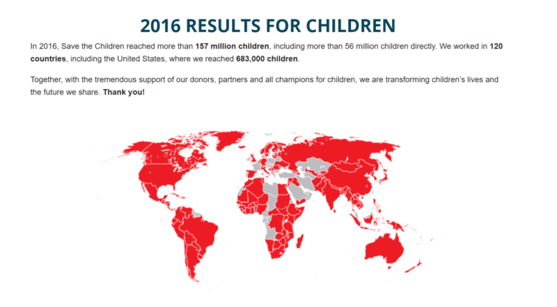
4. Impact
What is the immediate impact of your organization? As we discussed above, you should follow up the “problem” with your organization’s solution to that problem. Prove the efficacy of your solution by demonstrating impact through eye-catching infographics, statistics and stories.
Examples of Great Nonprofit Websites – The Impact
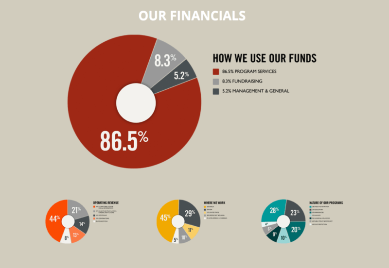
5. Transparency Is Important
According to a study in The Chronicle of Philanthropy,
1 in 3 Americans lack confidence in charities. In deciding where they will donate, 50% of survey respondents said it was “very important” for them to know that charities spend a low amount on salaries, administration, and fundraising; another 34% said it was “somewhat important.”
Anywhere you can put a number to something your nonprofit organization has done, you can better communicate your impact to a potential donor or sponsor. The more transparent your organization is about this, the more trust you will gain with your visitors.
Examples of Great Nonprofit Websites – Transparency
6. The Blog
Writing about your organization regularly is perfect for demonstrating impact, engaging supporters and sharing the work you’re doing with people new to your organization. Consumers want to be told a story. According to survey conducted by Adobe & research firm Edelman Berland, 73% agreed that brands should tell a unique story.
There are always opportunities to tell stories. It makes content so much more compelling when it is presented in the context of a story. Make sure your organization is taking advantage of the stories behind how your nonprofit began, why your cause matters, and who your organization is helping, and make sure that content is communicated on your website.
Not sure what to blog about? No problem! Here are some nonprofit blogging ideas for you:
• Letters from staff, volunteers or constituents in the field
• Photo essays from events or fieldwork
• Fact roundups on your specific cause or cause-sector
• News updates specific to your cause-sector or the region you’re working in
• Impact stories
• Behind-the-scenes videos or write-ups about your work
• Announcements about partnerships or matching grants
• Celebrate milestones and supporters
Examples of Great Nonprofit Websites – The Blog
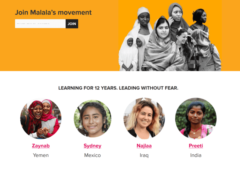
7. Subscription Box
The subscription box is related to the blog in the sense that newsletters increase transparency, deepen engagement and keep people up-to-date with how their support is directly impacting your cause.
Encourage supporters to subscribe to your newsletter by including a clear call to action on your homepage. “Join us” seems to be a popular call-to-action.
Examples of Great Nonprofit Websites – The Subscription Box

8. Look Beyond the Home Page
It’s important to look beyond the home page. If you look at site analytics, you might even discover that more traffic enters your site from other pages than the home page.
The homepage is becoming less and less relevant. The home page still serves many functions. It represents your brand/organization, and in many cases it’s the first introduction to your brand for people who search for your organization by name or navigate directly to your URL.
But the home page is also the most unfocused page, because it has to consider the needs and motivations of every potential audience member, as well as introducing your organization and explaining why someone should care.
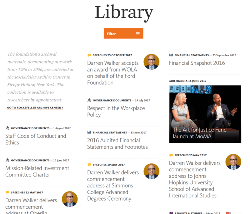
9. Resources Page
Have a Resources page accessible through your site’s top-level navigation where the public can find reliable, current information about issues central to your nonprofit’s cause. Keep this page updated and well maintained. If part of the value your nonprofit creates is from publishing resources, this is the place to host them.
Examples of Great Nonprofit Websites – The Resource Page
10. Members Only Page
There are quite a few reasons why you would have a members-only section set up on your nonprofit website. In some cases, this type of section may be needed for privacy and security reasons, preventing the release of confidential information.
In other scenarios, a members-only section might host exclusive resources, or a member directory for paying members of the organization. Just seeing the “Members-only” tab on your website is enough to entice some potential members to join your organization online, knowing they’ll get instant access to these things.
11. Campaign Landing Pages
Apply the same principles from your main website for your specific campaign microsites. For a campaign, make sure you add your campaign’s goal and campaign’s progress.
12. Optimize For Mobile
Mobile traffic now makes up 53% of all internet traffic. People today expect a great mobile experience. It’s imperative to make mobile content not just passable or functional, but truly seamless and easy.
At this point, this should go without saying. If your website is not mobile optimized, then you are really missing the boat – or at least a boatload of donors. Unfortunately, many nonprofit websites lag far behind on optimizing for mobile.
Your nonprofit organization should keep mobile in mind while designing to ensure that your site will translate well. Keep layouts vertical, use larger fonts and buttons, and avoid cramming too many elements onto the page.
If you’re unsure of whether or not an element will look good and be easy to use on mobile, remember: you can always take out your mobile device and check!
13. Intuitive Navigation
Well-planned and intuitive site architecture not only informs search engines of the importance of pages in rankings, but it is also important to user experience. Is it easy to find the expected information? What are the real goals of your nonprofit website? Does the architecture of your site support those goals?
- Including a top or left side navigation bar that’s visible on every page of your website (minus your donation form).
- Keeping all navigation titles between 1-3 words.
- Avoiding jargon, elaborate words, or language that doesn’t clearly or accurately portray the content on the page it’s linking out to.
- If they’re needed, sticking to only one level of drop-down menus.
14. Page Load Time Under 3 Seconds
Page load time is essential. By minimizing page load time (ideally less than 3 seconds), your organization will significantly increase the chances that the donors who click on your website will actually land there and stay long enough to look around.
If donors have to wait minutes (or even too many seconds), they’re likely to simply abandon the page. After all, visitors can easily turn to another site to access the information they want if it takes too long for your website to load. Check out your website page load speed by visiting GT Metrix.
Here are a few things you can do to help your website load as quickly as possible:
- Resize and compress all images.
- Minimize the number of scripts, plugins, and custom fonts used.
- Opt for HTML and CSS over Flash Player.
15. Website Security
Most of the recent and high profile security breaches can be traced back to weak passwords and faulty website authentication.
If your nonprofit organization wants to maintain a secure website, it’s time you looked into more secure credentials, like two factor authentication and SSL encryption.
Having a secure website protects you and your donors’ information so that you can maintain your supporters’ trust.
16. Matching Gifts
One of the easiest ways to increase online donations is to offer matching gifts. After all, you’re essentially receiving two donations for the price of one!
The problem lies in the fact that many donors simply aren’t aware of the option to give a matching gift.
To add a matching gift tool to your website, you’ll first need to find a vendor (like Double the Donation!).
Ask your website developer if your website is compatible with a matching gift service. If so, it should be easy to embed the tool into your website with a simple piece of code. If not, you’ll need to work with a vendor who provides custom development options.
By adding a matching gift tool to your site, you ensure donors know about this option and give them the resources they need to follow up on submitting their gifts.
17. Nonprofit Website and Donor Database Integration
Between online donations, event registrations, membership signups, and other online forms, your organization will likely be receiving a lot of donor data through your website. By integrating your website and your CRM, you’ll eliminate the need for manual data management, which can be time-consuming and prone to human error.
Instead, all new data you collect will automatically filter into donor profiles, making the data collection process much easier.
18. Marketing Automation – Email and Social Media
The two most common digital communications channels are email and social media.
Your organization can incorporate email into your website by adding a subscription box that enables visitors to sign up for your newsletters. Your email marketing platform should generate a code that you can easily place on your website to get this feature.
As far as social media goes, include social sharing buttons so that supporters can forward your content to their networks. If you’re active on social media, you can also embed social media feeds to share current updates.
19. Consistent Branding
Standardizing branding will ensure that visitors feel secure when browsing your site.
Think about it: if users suddenly land on a page that looks completely different from the rest of the site, chances are they’ll mistake it for someone else’s website. Considering that they want to engage with your organization, they’re not likely to trust pages that don’t look like they came from you.
If, on the other hand, they see your organization’s look and feel throughout your site, supporters can be confident that they’re interacting with you, which will make them feel much more comfortable submitting donations and taking other actions.
As long as your organization is using a content management system (CMS) like WordPress or Drupal, this is not so hard to achieve.
20. Powerful Photography
Photography plays a big role in first impressions. Research shows that using faces in your design can increase engagement by over 30%. Just take a look at this image below and take note of how much it grabs your attention:
21. Minimal and Uncluttered Design
Donors don’t respond well to complex, busy websites. They are already going out of their way to help your cause, the last thing you want to do is scare them off with a cluttered and complex web site.
Minimalism is important because:
- It makes your site easier to navigate, since visitors won’t have to wade through a bunch of information and elements to find what they want.
- It helps your most important content stand out, since it won’t be competing for visitors’ attention.
- It will keep your site looking current for longer and reduce the amount of major updates you’ll have to make. Simplicity is always in style!
Ultimately, taking a minimalist approach highlights the problem, solution, and impact provided by your nonprofit organization.
22. Multiple Opportunities for Engagement
While making sure that you can receive online donations might be your organization’s main website goal, some of your visitors might not be ready to take the leap and make a gift.
If you don’t include other engagement opportunities throughout your website, you’ll be missing out on building relationships with supporters who wish to engage with you in other valuable ways.
A supporter who gives their time through volunteering or access to their network through social sharing is just as an important to cultivate as a potential donor.
23. Highlight CTAs in Site Navigation
Visually highlight your most significant call to action within your navigation menu. On any page, that goal will be prominent and easily accessible. Secondary CTAs can be a more muted color but still be visually prominent.
24. Optimize Donation Pages
There are a number of things you can do to optimize your donation pages:
- make it easy to donate
- use trust indicators like badges, independent ratings, and financial disclosure
- make an emotional appeal
- translate donation amounts into monthly impact
- provide the option for recurring donations
25. The Post-Donation Experience
Don’t forget about the post-donation experience. After a person has donated, make sure the thank you page shows them your appreciation. Then, make them feel valued with a tailored thank you email, including further steps on how they can continue to support your nonprofit’s mission and cause.
Put these best practices into practice, and your nonprofit website will truly be a great website. Does your non-profit need a technology partner to help implement strategies like these for your website? If so, contact us!