
List Posts Done Right – Ten Steps To Social Share Stardom
Have you noticed that list posts (top ten lists) dominate the Internet right now? That’s because, after infographics, list posts get the most social shares. They are so popular there are blogs entirely devoted to list posts.
Because there is now so much competition, you have to make sure that you write consistently great list posts.
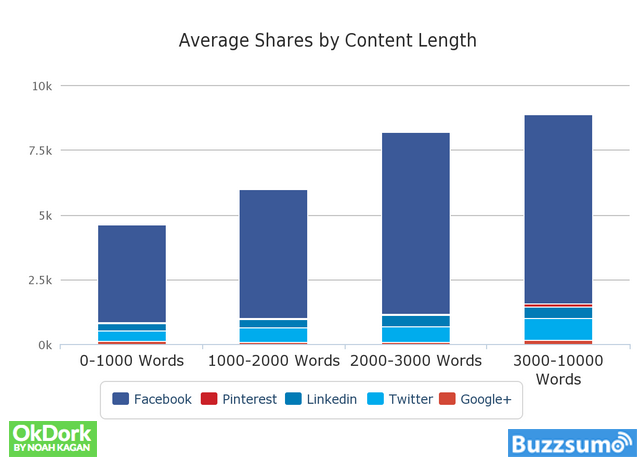
Average Shares by Content Length
List Posts Done Right – Ten Steps To Social Share Stardom
Step 1 – Use the right number of items
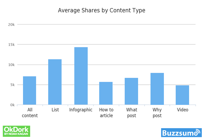
Average Shares by Content Type
How many items should you have in your list post? The number is 10.
Ok Dork and Buzzsumo analyzed 100 million articles. The most popular posts featured the following number of items: 10, 23, 16, and 24 (in this order).
The difference in popularity is significant. List posts containing 10 items got four times more shares than the runner-up – posts with 23 items.
Step 2 – Make your list scannable
The whole rationale behind a list post is for someone to digest the information quickly. This means if your post isn’t scannable, you’re doing something terribly wrong.
Just look at this post… You can figure out the main points I am trying to convey by scanning each headline.
You don’t have to read any more than the headlines if you are short on time.
Step 3 – Write an introduction
Just because you are writing a list post doesn’t mean you can start the post by going directly into your first point. You have to woo your readers a bit. Let them know what the purpose behind the post is and why they should read it.
Next time you are writing a list post, make sure you include an introduction.
Step 4 – Include pictures
A picture really does say a thousand words. By including a picture, you will help people better understand the points you are trying to get across.
However, the images must be relevant, and they can be data-oriented. For example, I used a graph at the beginning of this post to convey how successful list-based posts are.
Step 5 – Do not place lists within lists
This list post has 10 main points. Do not place lists within lists. If you want to break down specific points in your list, use bullets. But be warned.
Readability is a huge component of how well your list posts will do. If you add lists within them, you will lose your readers and social shares.
Step 6 – Write a conclusion
At the end of your post, you need to summarize the main message.
By adding a conclusion and clearly labeling it as a conclusion, you’ll be able to get 10% more of your visitors to read your content.
Step 7 – Engage with your readers
A list post on its own is not engaging. Engage your readers by asking questions. Use the words “you” and “I” within your posts to help create a conversation and keep people engaged.
Step 8 – Go into detail
A list post needs to have about 2,000 words. Remember that the whole point is to actually engage and teach something?
Longer posts that make sense and have good content are rewarded with more social shares and higher search traffic.
Step 9 – Make your list tweetable
By making each of the list elements within your post tweetable, you’ll get 30% more tweets on average.
A simple way to integrate this within your blog is to use Click to Tweet.
Step 10 – Optimize for the right audience
Writing a list post for consumers is much different than writing it for businesses.
Businesses want more details and information than consumers do. Consumers have shorter attention spans and just want to see the information as quickly as possible.
For example, if I were writing a list post for a consumer blog, I would use more visuals than anything else. On the other hand, if I were writing for a business blog, I would use more stats and data.
To get a good sense for writing for consumers versus businesses, you should read this checklist.
Conclusion
Writing list posts isn’t rocket science but there’s an art to it. If you pay attention to the 10 steps above and use the solutions I supplied you with, your search and social share traffic should increase.


