Terrible Web Design Trends and How to Stop Them
From LiveStrong yellow wristbands to Planking, the power of trends is undeniable. In our digital age dominated by social media and audiences with ever-shortening attention spans, these rapidly changing trends extend to web design as well. Continuously developing design and development technologies means that web design trends come and go quickly. While it might be cool to be an early-adopter, it certainly doesn’t pay to be a late-adopter or you will be left with a website with one of the following five terrible web design trends. Thankfully, most of these are not that common anymore.
Splash Pages
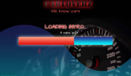
We’ve all seen a site that loads with sliding photography, blinking status bars, and a cacophony of visual excess. The thought behind a splash page is “Watch this long ‘short intro’ video to discover how awesome our website is!”
Hoping for a strong first impression, websites that adopt this practice of showing a splash page definitely make an impact. Unfortunately, it’s usually an overly negative one.
Splash pages waste time and delay people from accessing the real website content. Site users just flock to the “click to skip” link, or, in some cases, can’t even find it and decide to leave instead of waiting.
Conclusion:
A good homepage, information architecture (how the information is organized), and content strategy are all you need. Don’t waste precious time by showing users pointless filler content.
Web 2.0 Design
Rounded corners, reflections, drop shadows and gradients say one thing: 2005. As the Internet moves toward a flatter, harder-edged aesthetic, don’t let your site get stuck with an outdated look.
These days, dimensionality and drop-shadowing look soft and tentative. Skeuomorphism for skeuomorphism sake doesn’t really accomplish anything, other than potentially confusing your viewer with an over-complicated design. You can do better. Simplify your designs to make your interfaces more user-friendly and to improve UX.
Conclusion:
With major tech companies like Apple, Microsoft, Google and others going flat, the reality is that this is what users will come to expect.
Stock Photos
Good stock photos don’t actually look like a stock photo, but they can be prohibitively expensive. So, instead, we are often shown cold, lifeless fake photos of people.
Conclusion:
Use stock photography sparingly. If photos are needed on your website, try and take them yourself. If this is not an option, be very selective with your stock photography. Make sure that adding the photo is actually going to improve the look of your site instead of making it look like a joke.
MySpace-ification
Thankfully we don’t see this too often anymore, but in the mid-2000s, internet-savvy users were defined by the amount of personalization in their MySpace profiles. Unfortunately some web designers picked up on this trend, over-designing sites to the point of complete chaos.
Conclusion:
This one is simple. Just because you can, doesn’t mean you should.
Flash Sites
The strength of Flash is also its weakness. Though animations and movement definitely grab attention and can enhance the look of your site, they are also incompatible with many Web devices (all Apple products).
What good is a large amount of visually-stimulating content if many of your users can’t even see it?
With the maturation of CSS3 transitions and HTML5 standards, it is now possible to create impressive animated sites without the use of proprietary, closed-source software.
Conclusion:
It’s time to stop relying on Flash and get on board HTML5, CSS3 and JavaScript which accomplish many of the same things as Flash with less compatibility and performance issues.
Background Music
Some web designers want to engage their viewers’ senses, so they add some tunes to help build a connection. If you’re considering this, keep in mind two things: 1) some of your viewers have their sound muted and will thus miss out on your awesome jams, and 2) those that do have the sound on are likely listening to something else or looking to hear something specific.
Not to mention the potential issues with site loading speed, licensing, user experience, etc.
Conclusion:
Unless you’re a DJ company or a radio station, please skip the urge to add music to your site.
Popup Windows
I think we have all experienced the frustration of loading a webpage and immediately being bombarded with a trillion unclosable pop-up windows. It truly harms our experience on the site and makes us wary of coming back.
Unfortunately, today, popup windows are being reincarnated in the form of modal window overlays that open automatically and interrupt our reading experience. Check out Tab Closed; Didn’t Read to see a showcase of disruptive window overlays.
Conclusion:
Ads are a part of life, and they’re an important way for many sites to generate revenue. That being said, no one likes an ad that’s overly disruptive. If you’re going to use popups, use them sparingly, strategically, make sure they can be closed and don’t cover the entire screen.
Like any trend, what’s popular in web design comes and goes quite quickly. If you have a robust development and design team, incorporating current trends can make your site look fresh and relevant.
Just remember that trends have a shelf-life, and be prepared when it’s time to make a change. What’s hot right now could soon go the way of sparkly mouse pointers and site visitor counters.
For those who are more risk-averse (or strapped for time or by budget), it’s best to focus on more mainstream design ideas that will always look professional and be effective.


Greetings! I’ve been reading your weblog for a while
now and finally got the bravery to go ahead and give you a shout out from
Huffman Texas! Just wanted to mention keep up the excellent work!
I read this paragraph completely on the topic of the
difference of newest and earlier technologies, it’s
amazing article.