
Tools for Improving Readability
If you create user-friendly content, you understand readability. If usability and user-interface is important, then readability should be a top priority.
When your content is readable, it’s easier to consume. If usability and UX is important, then readability should be a top priority. User-friendly content may even improve your search ranking.
Website readability is governed by two components – Writing Style and Typography.
Writing Style Tips for Improving Readability
- Use section headings to split up long articles
- Highlight important words and phrases by using bold and italics
- Use bullet points to make lists easier to read
- Avoid jargon; use simple words
- Avoid the passive voice
- Proof-read your work and use spell check to avoid glaring grammar mistakes
Typography Tips for Improving Readability
- Choose a main content font that is easy to read on all devices
- Make sure the font size is large enough
- Use a dark color font on a light background
- Don’t use dark backgrounds if you want people to read your content
Online Tools for Improving Readability
This online tool will check your writing under well-established readability formulas. E.g., the Flesch Kincaid Reading Ease and the Automated Readability Index.The Readability Test Tool also furnishes statistics about your text. It shows you the number of complex words and average number of words per sentence in your work. Try to lower these two metrics when you’re editing for readability.

Spelling errors and grammar mistakes make for hard, distracting reading. Grammark can help find grammar and spelling issues. It will also point out wordiness, vague language, and other problem areas.

This online editor helps you write clearly and concisely. The tool highlights complex sentences and phrases, the use of passive voice, and adverbs. Hemingway Editor gives you a dynamic readability grade as you write. It also displays information such the estimated reading time of your article. In the screenshot below, I pasted an article from the Washington Post. As you can see it scores very low on readability.

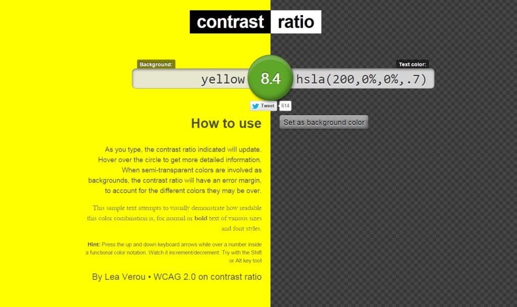
Design is a big part of readability and text legibility. Good foreground/background color contrast ratio is key to reading comfort. This is an open source tool for calculating the contrast ratio of two colors. It can help you choose good colors for a pleasant reading experience.


I’ve been seeing that HemingwayApp all over the place! What a great tool that seemingly sprang into existence out of no where.