Six Most Important Elements on Your Homepage
People have very short attention spans.
HubSpot reports that “55% of visitors spend fewer than 15 seconds on your website.” Half of you are probably already gone.
So how do you GRAB ATTENTION? You do this by putting the most important elements on your website above the fold. The above the fold language comes from print newspapers – it’s simply the upper half of the front page of a newspaper where the top story was printed. Above the fold in print looks like this:

Online, above the fold translates to the portion of a web page that is visible in a browser window when the first page loads. It’s what visitors first see without scrolling.
Why is above the fold so important?
- It’s what people see first.
- It’s what attracts the most attention.
- It’s where visitors spend 80% of their time!
Six Most Important Elements on Your Homepage
Unique Selling Proposition (USP)
Your unique selling proposition or unique selling factor is the single thing that differentiates you, your product, or your service from its competitors. It is absolutely essential that this is above the fold. The USP is your way of instantly showing your visitors exactly how they will benefit by exploring your website further.
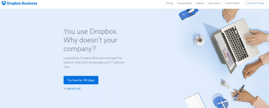
Here’s the Unique Selling Proposition for Dropbox:

Visitors know immediately that the site is for businesses that might benefit from using dropbox.
Copy that Explains Your Unique Selling Proposition
The explainer copy fills in the details. In the Dropbox case, above, the explainer copy is “upgrade to Dropbox Business and get the solution that both employees and IT admins love.” It’s brief and concise but visitors can quickly tell what the site can accomplish for them. When effective, the explainer copy should raise the visitor interest level and encourage them to keep exploring the website.
Logo
Your logo is critical. It must be on the homepage – preferably in the left-hand corner. Brand recognition is of utmost importance. You want to establish consistent branding and take every opportunity to reinforce your brand identity.
Simple Navigation
Suppose a visitor has landed on your website for the first time. After seeing your Unique Selling Proposition and explainer copy they have a good idea of what it is you do and what you are offering. After seeing your logo, they associate it with you. Now you’ve piqued their interest and they want to learn more. It’s your responsibility as a website owner to give them a framework to explore your website in a logical, streamlined fashion. Allow me to give you a few examples of brands that do this really well.
First there’s Dropbox again:

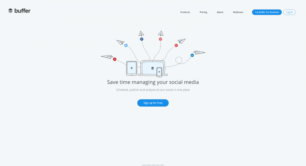
Then there’s Buffer:

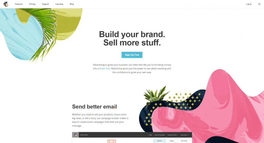
And finally there’s Mailchimp:

Notice that all three of these examples feature simple, intuitive navigation. Visitors can easily and quickly find what they’re looking for with minimal effort.
Contact Information
If I had to pick a pet peeve, this would be it. So many websites are missing clear contact information. People want to make sure you are a legitimate business and not a scam artist. Having full contact information will build trust and strengthen credibility. Include your contact information – not just a contact form. Give visitors multiple ways of reaching you.
Call To Action (CTA)
It turns out that it doesn’t matter as much where you put your call to action. Your site definitely needs a call to action. If you manage to sustain your visitors’ eyeballs longer than average, they will stumble across your CTA (it should be somewhere on your home page). If you can put your main CTA above the fold on the home page and do it without overwhelming your visitors, then do it. Keep it simple and focus on a single CTA.
Conclusion
Here’s a recap of the six most important elements on your homepage:
- A well-written Unique Selling Proposition (USP)
- Some brief copy that explains your USP
- Your logo
- Simple, intuitive navigation
- Contact information
- A Call to Action


Leave a Reply
Want to join the discussion?Feel free to contribute!