
Loud Colors Can Improve Your Website User Interface Design
Color is a powerful design tool. Loud colors can grab your attention, set the mood, and influence a website visitor’s emotions and actions. In the past, loud colors were exclusively used by websites with playful, cartoonish designs. Increasingly, however, we are seeing the use of bright colors on all kinds of more traditional business websites. The appeal of the vibrant color trend is that it is very versatile and can be applied in many different ways.
Overlays
Overlaying is filtering an image through a color lens. Images with color overlays have been popular for a long time because it’s relatively easy to apply and has the power to focus user attention.
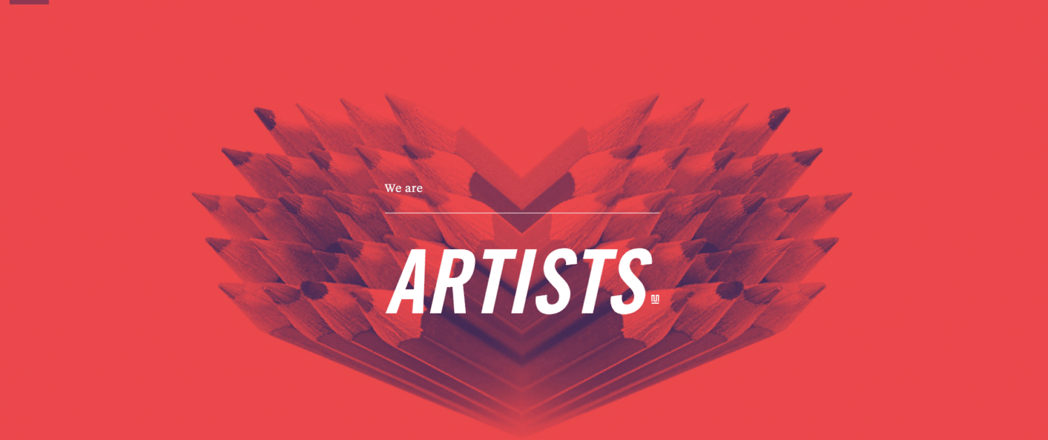
Color Overlay Example
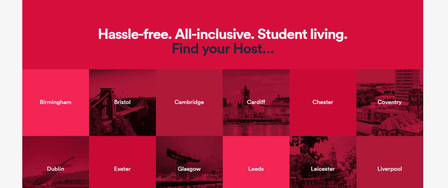
Monotone
One of the most popular ways of using loud colors in your website design is a technique called monotone. Monotone palettes consist of a single color with a mixture of shades and tints. Monotone color schemes are usually really easy to read as they establish a solid foundation for foreground content and typography usually “pops” off the screen.
Example of a monotone website color palette
Duotone
Duotone palettes are made up of two colors. This can either be two contrasting colors or two shades of the same color.
Example of Duotone color scheme in website design
Gradients
Gradient color schemes are back again however this time they are being used with high-contrast complementary colors. Modern gradients are also now being used as accent colors. Look at the gradients that are used in the navigation on Bloomberg’s site below:
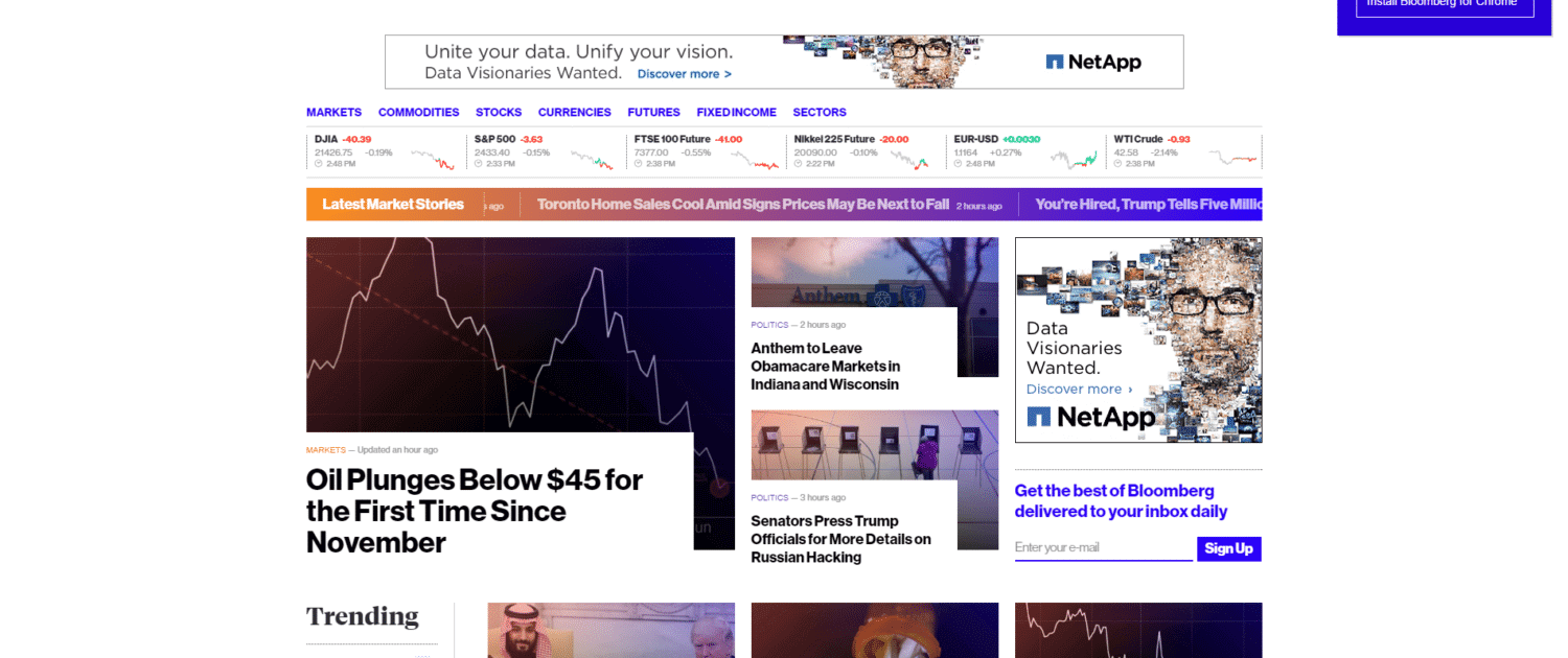
Gradient color scheme example


Leave a Reply
Want to join the discussion?Feel free to contribute!